React Components and TypeScript(Part 1) (Function Components)

If you are already coding in React and looking to get a grasp of how to use Typescript with React, then this tutorial is for you.
In this tutorial, we are going to build a movie gallery with the OMbi API, using React and Typescript. You will learn the syntax you need to properly define types for your Functional components.
Typescript is a typed programming language that type-checks your code for errors even before you run them. It was developed by Microsoft and is referred to as a typed superset of JavaScript, and includes its own compiler.
Prerequisites:
- prior knowledge of JavaScript, and React
- basic knowledge of Typescript
- Node and npm (or any other package manager) installed
Setting up the project
To start, we need to initialize a React project with Typescript template using the create-react-app tool. In the terminal, run the following command:
npx create-react-app movie-gallery-with-typescript --template typescript
This command downloads an already configured React Typescript template, ready for you to start building. Let’s clean up the project a bit to remove files we do not need.
Replace the contents of App.tsx with:
import './App.css';

function App() {
  return (
    <div className="App">
      <p>Hello world!</p>
    </div>
    )
}

export default App;
then go ahead and start the development server with npm start

If you see the above screen then you are ready to start building!
Let's go!
Let's create a folder in the src folder, called components. Let's create a file called GetMovies.tsx. This is where we will fetch the movies and pass on to a child component.
Right, so let’s define a functional component in Typescript.
Create a Functional Component
There are two methods of creating a Functional Components in Typescript. One way is to define types for our props and pass to the functional component.
Eg:
interface PropsTypes {
     name: string
}

const GetMovies = (props: PropsTypes) => {
      return (
        <div>
            <p>{props.name}</p>
        </div>
    )
}
The second way is using the generic React.FC interface. No much difference between these two, except that this method allows for optional child components implicitly.
interface PropsTypes {
     name: string
}

const GetMovies: React.FC<PropsTypes> = (props) => {
      return (
        <div>
            <p>{props.name}</p>
             {props.children}
        </div>
    )
}
For this tutorial, we are going to use the previous method, because the React.FC has been discouraged by the React team at Facebook. Read more here.
Moving on, let's define the states we will use in the component.
useState() hook and TypeScript
While using useState() hook, type inference works very well with simple data types. Eg:
const [loading, setLoading] = useState(true);

setLoading(2)
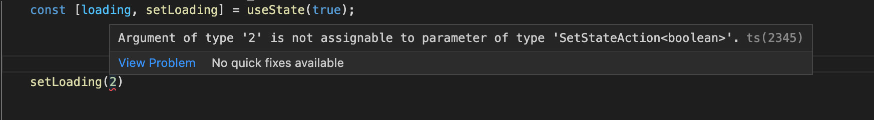
As you can see in the screenshot above, Typescript was expecting a boolean to be passed to the setLoading() function and threw an error when it got a different data type.
However, defining a type explicitly is also acceptable.
Eg:
const [loading, setLoading] = useState<boolean>(true);
But there is no need for it in this case, really.
And because the values we initially set, get per component update, and set through events to the useState() hook always have the same type, TypeScript is able to check these values without needing additional code.
When dealing with more complex data types like an array of objects, we define a type and pass it to the useState() as we will see shortly.
We are going to create a .ts file for this next type definition because we will need to use it more than once in the project.
Create movieTypes.ts in src and write the following lines of code in it.
// movieTypes.ts

export interface MovieObjTypes {
    Poster: string,
    Title: string,
    Type: string,
    Year: string, // the year returned from the API is a string
    imdbID: string // the ID returned from the API is a string
}
Let's import MovieObjType in the Getmoves.tsx file and use it.
// Getmoves.tsx

import {MovieObjTypes} from '../movieTypes';

const [movieData, setMovieData] = useState<MovieObjTypes[]>([]);
That's it, that is how to define complex data types and pass to the useState() hook.
Now it is time to make an API call and fetch our movies.
useEffect() hook and TypeScript
We use the useEffect() hook for performing side effects and return an optional cleanup function which means they don't deal with return values, no types are necessary.
Include the following in the GetMovies.tsx file:
useEffect(() => {
        fetch("<http://www.omdbapi.com/?s=women&page=5&type=movie&apikey=********>") // replace ******** with your api key
            .then((data) => data.json())
            .then((response) => {
                setLoading(false)
                setMovieData(response.Search)
            })
            .catch((error) => {
                console.log('error', error);
                setLoading(false)
            })
    }, [])
And now we will send the data to our MoviesCard component, which we will create next. Below is the whole code for the GetMovies.tsx file
// GetMovies.tsx

import React, { useEffect, useState } from 'react';
import {MovieObjTypes} from '../movieTypes';

const GetMovies = () => {
    const [loading, setLoading] = useState<boolean>(true);
    const [movieData, setMovieData] = useState<MovieObjTypes[]>([]);

    useEffect(() => {
        fetch("<http://www.omdbapi.com/?s=women&page=5&type=movie&apikey=********>") // replace ******** with your api key
            .then((data) => data.json())
            .then((response) => {
                setLoading(false)
                setMovieData(response.Search)

            })
            .catch((error) => {
                console.log('error', error);
                setLoading(false)
            })
    }, [])

    if(loading) return <p>Loading...</p>

    return (
        <div>
            <h2>Welcome to my movie gallery</h2>
            <MoviesCard movieData={movieData}/>
        </div>
    )
}

export default GetMovies;
Nice!😎 Next is to create the MoviesCard.tsx file in the components folder.
const MoviesCard = () => {
    return (
        <div></div>
)
}
The MoviesCard component receives props from its parent, the GetMovies, so we will need to define prop types for them. we are going to use the same types we defined initially. So lets go ahead and import it.
import {MovieObjTypes} from '../movieTypes';

interface MovieProps{
    movieData: MovieObjTypes[],
}
Above we imported the already defined movie data object and created the array of objects interface with it. Now let's go ahead and use it in our component.
const MoviesCard = (props: MovieProps) => {
    const {movieData} = props;

    return (
        <div>

        </div>
    )
}

export default MoviesCard;
Now let's loop through our data and display them.
return (
        <div>
            {
                movieData.length > 0 && movieData.map(val => {
                    return (
                        <div>
                            <div>
                                <img src={val.Poster} alt={`${val.Title} poster`}/>
                            </div>
                            <div>
                                <h5>{val.Title}</h5>
                                <p>{val.Year}</p>
                            </div>
                        </div>
                    )
                })
            }
        </div>
    )
Great! our app is taking shape.
To further demonstrate Functional Components and Typescript, we will create a button component that we will use to display the movie year and ''Details".
Create CustomButton.tsx in the components folder.
Now we define the prop types for our CustomButton component.
Optional props
Sometimes some props are optional. To define the types for those optional props we add a question mark to the interface. That way Typescript won't yell at you when you omit it.
Eg:
interface ButtonProps {
  bgColor: string;
  title: string;
  disabled?: boolean,
  onClick?: () => void
}
As you can see above, we won't always need the disabled and onClick properties so we used the question marks to indicate that they are optional.
And then the component.
const CustomButton = (props: ButtonProps) => {
  const {bgColor, title, onClick} = props;
  return (
    <button
        className='btn-style'
        style={{backgroundColor: bgColor}}
        disabled={disabled}
        onClick={onClick}
    >
      {title}
    </button>
  );
}

export default CustomButton;
Let's add a little style too. Create styles.css in src folder and add these styles.
.btn-style {
  border: none;
  border-radius: 20px;
  padding: 10px;
  width: 8rem;
  color: whitesmoke;
  margin-bottom: 10px;
  cursor: pointer;
}
Remember to import the styles.css file into the CustomButton component:
import '../style.css';
Now to apply our button component, we import it into the MovieCards.tsx file and supply it all the props it needs. So at the end, the MoviesCards.tsx file is like this:
import React from 'react';
import {MovieObjTypes} from '../movieTypes';
import CustomButton from './CustomButton';
import '../style.css';

interface MovieProps{
    movieData: MovieObjTypes[],
}

const MoviesCard = (props: MovieProps) => {
    const {movieData} = props;

    return (
        <div className='card-container'>
            {
                movieData.length > 0 && movieData.map(val => {
                    return (
                        <div className='card'>
                            <div className='poster-div'>
                                <img src={val.Poster} alt={`${val.Title} poster`}/>
                            </div>
                            <div>
                                <h5>{val.Title}</h5>
                                <p>{val.Year}</p>
                            </div>
                            <CustomButton
                            bgColor='grey'
                            title={val.Type}
                            disabled={true}
                            />
                            <br />
                            <CustomButton
                            bgColor='red'
                            title='See Details'
                            onClick={() => console.log('Clicked!')}
                            />
                        </div>
                    )
                })
            }
        </div>
    )
}

export default MoviesCard;
Before we check out the work in the browser let's add a little style to beautify things. Add the following to the styles.css file.
.card-container {
  padding: 3rem;
  display: flex;
  justify-content: space-between;
  align-content: space-between;
  flex-wrap: wrap;
}

.card {
  width: 15em;
  height: 35em;
  box-shadow: rgba(50, 50, 93, 0.25) 0px 6px 12px -2px,
    rgba(0, 0, 0, 0.3) 0px 3px 7px -3px;
  margin-bottom: 3rem;
  padding: 0, 0, 2rem;
}

.poster-div {
  width: 15em;
  height: 60%;
}

.poster-div img {
  width: 100%;
  height: 100%;
  object-fit: fill;
}
Nice! Import the GetMovies.tsx file into the App.tsx and save it so we can view our app in the browser.
import './App.css';
import GetMovies from './components/GetMovies';

function App() {
  return (
    <div className="App">
         <GetMovies />
    </div>
  );
}

export default App;
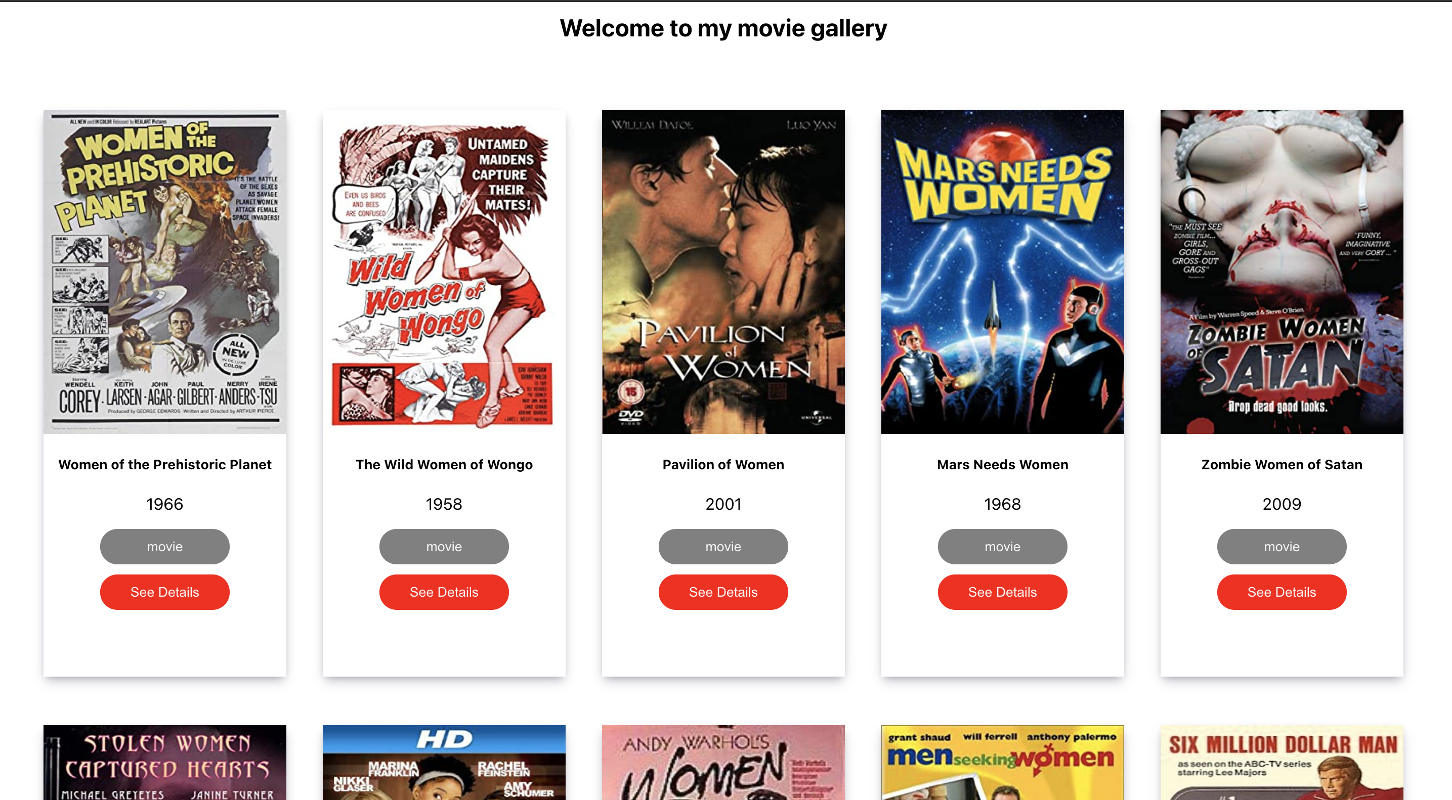
Nice! that is how our app turned out. In the second part of this article I will show you how to build the same movie gallery using React Class components instead. Check it out here .


