React Components and TypeScript(Part 2) (Class Components)

Welcome back!🤝
In the first part of this tutorial, we looked at the importance of TypeScript and we built a movie gallery with React(Functional Components) and Typescript. Check it out Here
In this concluding part, we are going to build the same movie gallery with React (Class components) and TypeScript.
Prerequisites:
- Knowledge of JavaScript, and React
- Basic knowledge of Typescript
- Node and npm (or any other package manager) installed
Setting up the project
To start, we need to initialize a React project with Typescript template using the create-react-app tool. In the terminal, run the following command:
npx create-react-app movie-gallery-with-typescript1 --template typescript
This command downloads an already configured React Typescript template, ready for you to start building. Let’s clean up the project a bit.
Replace the contents of App.tsx with:
import React, {Component} from 'react';
import './App.css';

class App extends Component {
  render() {
    return (
      <div className="App">
       <p>Hello world!</p>
      </div>
    );
  }
}

export default App;
Go ahead and start the development server to see if everything is working as expected. If you see the screen below in your browser then you are ready to start!👍

Let's start building!
Let's create a folder in the src folder, called components. Let's create a file called GetMovies.tsx. This is where we will fetch the movies and pass on to a child component. Right, so let’s define a Class component in Typescript.
Creating a Class Component:
Within TypeScript, React.Component is a generic type, with two optional type parameters
(React.Component). So we can define types for our states and props and pass them to React.Component See below.
interface MyPropsTypes {
  message: string;
};

interface MyStateTypes {
  count: number;
};

class App extends React.Component<MyPropsTypes, MyStateTypes> {
  state: MyStateTypes = {
    // optional second annotation for better type inference
    count: 0,
  };
  render() {
    return (
      <div>
        {this.props.message} {this.state.count}
      </div>
    );
  }
}
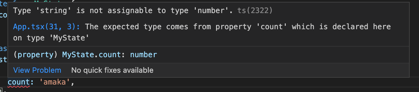
We get an error when we try to assign count to a string:
TypeScript and Constructor()
In React, the constructor function is used to initialize state and bind methods. Even though alternatively, you can initialize local state without using the constructor(class properties declaration) and declare class methods by using arrow functions without the extra need to bind them. Any of the approaches work really well. Subsequently, we will use the class properties declaration approach, but for those that prefer to use the constructor approach, this section is for you.
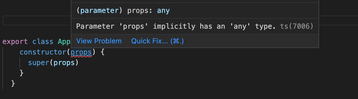
Declaring state the typical pattern of constructors and super calls in TypeScript’s strict mode throws an error if you don't provide a type. This is because you are creating a new class, with a completely new constructor, and TypeScript does not know which parameters to expect.
Therefore, TypeScript will imply them to be any. And implicit any in strict mode is not allowed.
Eg:
// declaring state using the constructor function

interface AppProps{
    name: string
}

export class App extends React.Component<AppProps> {
  constructor(props) {
    super(props)
  }
}
You solve this by specifying the types of the props while calling the constructor function. Eg:
interface AppProps{
    name: string
}

export class App extends Component<AppProps> {
    constructor(props: AppProps) {
      super(props)
    }

    render(){
        return(
            <div>{this.props.name}</div>
        )
    }
  }
Great! Moving forward, lets's declare our state in the GetMovies.tsx file (using the class properties declaration approach).
interface stateTypes {
    loading: boolean;
    movieData: MovieObjTypes[]
  };

class GetMovies extends Component<{}, stateTypes> {

    state: stateTypes = {
        loading: true,
        movieData: []
    }

    render() {
        return (
            <div>
                <h3>Welcome to my Movie gallery</h3>
            </div>
        )
    }
}

export default GetMovies;
Because we will use the MovieObjTypes interface more than once in the project, we will declare it in another file and export. That way we can use it anywhere. Let's create a TypeScript file called movieTypes.ts and write the following lines of code in it.
export interface MovieObjTypes {
    Poster: string,
    Title: string,
    Type: string,
    Year: string, // the year returned from the API is a string
    imdbID: string // the ID returned from the API is a string
}
Above we declared the states we need in this component. Notice how we passed an empty object as the first parameter to React.Component. This is because that position is for the props types, but because we don't need any props in this component, we passed an empty object so that the states types can maintain their position as the second parameter.
Also, the data structure we are expecting is an array of objects, that is why our movieData declaration is this way movieData: MovieObjTypes[]. Indicating an array of objects.
Nice! Now let us fetch our movies from the API.
TypeSCript and ComponentDidMount()
componentDidMount() is invoked immediately after a component is mounted, if you need to load data from a remote endpoint, this is a good place to instantiate the network request. The syntax used here is exactly the same as normal React. No need for type declaration here.
So let's go ahead to fetch our movies, set them in state and send to the child component
componentDidMount() {
        fetch("<http://www.omdbapi.com/?s=women&page=5&type=movie&apikey=********>") // replace ******** with your api key
            .then((data) => data.json())
            .then((response) => {
                this.setState({
                    loading: false,
                    movieData: response.Search
                })
            })
            .catch((error) => {
                console.log('error', error);
                this.setState({
                    loading: false,
                })
            })
    }
Now let's pass the data over to the MoviesCard component which we are yet to create. Below is the full code in the GetMovies.tsx file.
import React, { Component } from 'react'
import {MovieObjTypes} from '../moviesTypes';
import MoviesCard from './MoviesCard';

interface stateTypes {
    loading: boolean;
    movieData: MovieObjTypes[]
  };

class GetMovies extends Component<{}, stateTypes> {

    state: stateTypes = {
        loading: true,
        movieData: []
    }

    componentDidMount() {
        fetch("<http://www.omdbapi.com/?s=women&page=5&type=movie&apikey=********>") // replace ******** with your api key
            .then((data) => data.json())
            .then((response) => {
                this.setState({
                    loading: false,
                    movieData: response.Search
                })
            })
            .catch((error) => {
                console.log('error', error);
                this.setState({
                    loading: false,
                })
            })
    }

    render() {
        if(this.state.loading) return <p>Loading...</p>

        return (
            <div>
                <h3>Welcome to my Movie gallery</h3>
                <MoviesCard movieData={this.state.movieData}/>
            </div>
        )
    }
}

export default GetMovies;
Now let's go ahead to build the MoviesCards component.
This component will not have a local state and it will receive props from its parent.
We are going to use our moviesObj interface here too. See below for the code.
import React, { Component } from 'react'
import {MovieObjTypes} from '../moviesTypes';

interface MovieProps{
    movieData: MovieObjTypes[]
}

class MoviesCard extends Component<MovieProps> {

    render() {
        const {movieData} = this.props

        return (
            <div>
            {
                movieData.length > 0 && movieData.map(val => {
                    return (
                        <div className='card'>
                            <div className='poster-div'>
                                <img src={val.Poster} alt={`${val.Title} poster`}/>
                            </div>
                            <div>
                                <h5>{val.Title}</h5>
                                <p>{val.Year}</p>
                            </div>
                        </div>
                    )
                })
            }
        </div>
        )
    }
}

export default MoviesCard;
We will create one more component to further demonstrate how to create class components in Typescript. We will call it the CustomButton and we will use it to display some movie data.
Create a file in the components folder called CustomButton. Write the following code in it.
We will start by defining types for props we are expecting.
interface ButtonProps {
    bgColor: string;
    title: string;
    disabled?: boolean,
    onClick?: () => void
  }
That's it. Remember the question mark we use to tell typescript that some props are optional which I explained in the first part of this article.
Let's create our class component and apply this interface.
import React, { Component } from 'react'

class CustomButton extends Component<ButtonProps> {

    render() {
        const {bgColor, title, onClick, disabled} = this.props

        return (
            <button
                className='btn-style'
                style={{backgroundColor: bgColor}}
                onClick={onClick}
                disabled={disabled}
            >
            {title}
            </button>
        )
    }
}

export default CustomButton;
Let's add a little style too. Create styles.css in src folder and add these styles.
.btn-style {
  border: none;
  border-radius: 20px;
  padding: 10px;
  width: 8rem;
  color: whitesmoke;
  margin-bottom: 10px;
  cursor: pointer;
}
Next is to import the styles files into the CustomButton component so the style can take effect.
import '../style.css';
Nice! Next is to use our button component, we import it into the MovieCards.tsx file and supply it all the props it needs. this is the full code for the MoviesCards.tsx file:
import React, { Component } from 'react'
import {MovieObjTypes} from '../moviesTypes';
import '../styles.css';
import CustomButton from './CustomButton';

interface MovieProps{
    movieData: MovieObjTypes[]
}

class MoviesCard extends Component<MovieProps> {

    render() {
        const {movieData} = this.props

        return (
            <div className='card-container'>
            {
                movieData.length > 0 && movieData.map(val => {
                    return (
                        <div className='card'>
                            <div className='poster-div'>
                                <img src={val.Poster} alt={`${val.Title} poster`}/>
                            </div>
                            <div>
                                <h5>{val.Title}</h5>
                                <p>{val.Year}</p>
                            </div>
                            <CustomButton
                            bgColor='grey'
                            title={val.Type}
                            disabled={true}
                            />
                            <br />
                            <CustomButton
                            bgColor='red'
                            title='See Details'
                            onClick={() => console.log('clicked')}
                            />
                        </div>
                    )
                })
            }
        </div>
        )
    }
}

export default MoviesCard;
One last little thing is to style our movie gallery a bit. Add these styles to the styles.css file.
.card-container {
  padding: 3rem;
  display: flex;
  justify-content: space-between;
  align-content: space-between;
  flex-wrap: wrap;
}

.card {
  width: 15em;
  height: 35em;
  box-shadow: rgba(50, 50, 93, 0.25) 0px 6px 12px -2px,
    rgba(0, 0, 0, 0.3) 0px 3px 7px -3px;
  margin-bottom: 3rem;
  padding: 0, 0, 2rem;
}

.poster-div {
  width: 15em;
  height: 60%;
}

.poster-div img {
  width: 100%;
  height: 100%;
  object-fit: fill;
}
Nice! Import the GetMovies.tsx file into the App.tsx and save it so we can view our app in the browser.
import React, {Component} from 'react';
import './App.css';
import GetMovies from './components/GetMovies';

class App extends Component {
  render() {
    return (
      <div className="App">
       <GetMovies />
      </div>
    );
  }
}

export default App;
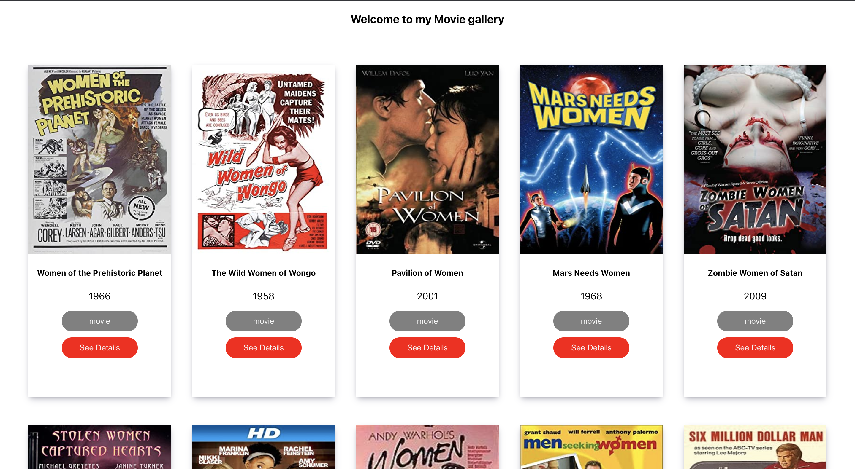
Great! this is how our site looks in the browser. Pretty cool huh!😎
Conclusion
A study shows that 15% of all JavaScript bugs can be detected by TypeScript. So it's definitely a nice tool to use and very easy to start with. You don't have to utilise it to the fullest at first, you can start small and learn/use more features as you go. I hope this article is helpful to get you started with using typescript in React.


